
| 일 | 월 | 화 | 수 | 목 | 금 | 토 |
|---|---|---|---|---|---|---|
| 1 | 2 | 3 | 4 | 5 | 6 | |
| 7 | 8 | 9 | 10 | 11 | 12 | 13 |
| 14 | 15 | 16 | 17 | 18 | 19 | 20 |
| 21 | 22 | 23 | 24 | 25 | 26 | 27 |
| 28 | 29 | 30 |
- 함수
- 다트
- Collection
- Flutter
- set
- animation
- List
- pushnamed
- ML
- python
- 크롤러
- Class
- 플러터
- 코틀린
- crawler
- 콜렉션
- text
- rust
- DART
- function
- variable
- 파이썬
- map
- kotlin
- textstyle
- 클래스
- 웹크롤러
- Android
- import
- package
- Today
- Total
조용한 담장
Flutter : Text Widgets 본문

Flutter : Text Widgets
Flutter 의 텍스트와 관련된 위젯들을 살펴보고 테스트 해보자.
텍스트를 그리는 Text 와 RichText 가 있고, 그래픽적 효과를 적용할 수 있는 TextStyle, 글자, 문장을 모아 문단을 구성할 수 있게 해주는 TextSpan 이 있다.
TextStyle class
TextStyle({bool inherit: true, Color color, Color backgroundColor, double fontSize, FontWeight fontWeight, FontStyle fontStyle, ... })
An immutable style in which paint text
화면에 그려지는 텍스트에 다양한 효과를 적용하기 위한 속성들을 지정하는 데에 사용된다.
글자색, 배경색, 글자체, 글자 크기, 폰트 종류 등 다양한 그래픽적 효과를 지정할 수 있다.
Text 나 RichText 등 Text 를 처리하는 class 의 style 속성에 사용된다.
Text Class
Text(String data, { Key key, TextStyle style, StrutStyle strutStyle, TextAlign textAlign, TextDirection textDirection, Locale locale, bool softWrap, TextOverflow overflow, double textScaleFactor, int maxLines, String semanticsLabel, TextWidthBasis textWidthBasis })
The Text widget displays a string of text with single style. The string might break across multiple lines or might all be displayed on the same line depending on the layout constraints.
문자열 data 를 화면에 그린다.
나머지 인자들은 텍스트를 꾸미기 위한 옵션이나 로케일 등 부가적인 설정들을 위한 것들이다.
Text('A Text widget');
Text(
  'bold text',
  textAlign: TextAlign.center,
  style: TextStyle(fontWeight: FontWeight.bold),
)
클래스 속성 몇개만 살펴보자면:
- textAlign : 문자를 수평적으로 배치하는 방법. (center, left, right, end, ...)
- textDirection : 문자 배치 방향. (ltr:왼쪽에서 오른쪽으로, rtl:오른쪽에서 왼쪽으로, ...)
- style : 문자의 스타일. (Bold, Italics, color, size, ...)
style 이 지정되지 않으면 기본 값으로 DefaultTextStyle 이 적용된다.
Text.rich()
Text.rich(InlineSpan textSpan, { Key key, TextStyle style, StrutStyle strutStyle, TextAlign textAlign, TextDirection textDirection, Locale locale, bool softWrap, TextOverflow overflow, double textScaleFactor, int maxLines, String semanticsLabel, TextWidthBasis textWidthBasis })
Creates a text widget with a InlineSpan.
하나의 스타일 보다 더 다양한 스타일의 문자들을 적용하여 문단을 만들 고자 할 때 쓸 수 있는 constructor 다. (TextRich 와 기능이 비슷하다.)
TextSpan 을 이용해 스타일을 적용하고자 하는 만큼의 문자, 문자열 지정할 수 있고, 여러개의 TextSpan 을 가질 수 있어 다양한 스타일이 존재하는 문단을 만들 수 있다.
style 을 지정하지 않으면 Text class 가 기본적으로 적용하는 DefaultTextStyle 을 적용하게 된다.
TextSpan class
TextSpan({String text, List children, TextStyle style, GestureRecognizer recognizer, String semanticsLabel })
An immutable span of text.
특정 길이의 문자(text)를 한 단위로 하여 스타일(style)을 적용하는데 사용한다.
자식 위젯으로 TextSpan 리스트를 가질 수 있으며, 모두 한 문단으로 화면에 그려진다.
text 와 children 둘 다 값을 가지면, 자식 위젯 리스트 중 첫번째 위치의 text 값으로 으로 적용된다.
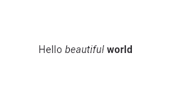
const Text.rich(
  TextSpan(
    text: 'Hello', // default text style
    children: <TextSpan>[
      TextSpan(text: ' beautiful ', style: TextStyle(fontStyle: FontStyle.italic)),
      TextSpan(text: 'world', style: TextStyle(fontWeight: FontWeight.bold)),
    ],
  ),
)
TextSpan 의 text 인 'Hello' 는 기본 문자 스타일,
자식 위젯 TextSpan 인 ' beautiful ' 은 italic 스타일,
두번째 자식 위젯 TextSpan 인 'world' 는 bold 스타일로
최종적으로 모든 TextSpan 이 이어져 만들어진 문단이 화면에 그려진다.
Text example

RichText class
RichText({Key key, @required InlineSpan text, TextAlign textAlign: TextAlign.start, TextDirection textDirection, bool softWrap: true, TextOverflow overflow: TextOverflow.clip, double textScaleFactor: 1.0, int maxLines, Locale locale, StrutStyle strutStyle, TextWidthBasis textWidthBasis: TextWidthBasis.parent })
The RichText widget displays text that uses multiple different styles.
여러개의 다른 스타일을 가진 문자를 화면에 그린다. Text.rich 와 마찬가지로 TextSpan 을 사용한다.
다른점은 Text.rich 는 DefaultTextStyle 을 기본적으로 적용 하지만, RichText는 그렇지 않으므로 기본 스타일을 명시해야 한다.
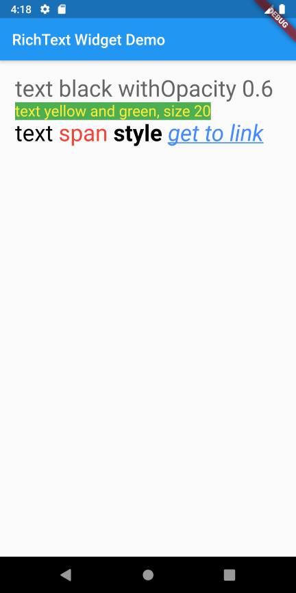
// DefaultTextStyle 을 기본으로 명시적 적용.
RichText(
  text: TextSpan(
    text: 'Hello ',
    style: DefaultTextStyle.of(context).style,
    children: <TextSpan>[
      TextSpan(text: 'bold', style: TextStyle(fontWeight: FontWeight.bold)),
      TextSpan(text: ' world!'),
    ],
  ),
),
// style 이 생략되어 DefaultTextStyle 이 적용.
Text.rich(
  TextSpan(
    text: '12. text rich ',
    children: <TextSpan> [
      TextSpan(text: ' with '),
      TextSpan(text: 'TextStyle.'),
    ],
  ),
)
TextTheme class
TextTheme({TextStyle display4, TextStyle display3, TextStyle display2, TextStyle display1, TextStyle headline, TextStyle title, TextStyle subhead, TextStyle body2, TextStyle body1, TextStyle caption, TextStyle button, TextStyle subtitle, TextStyle overline })
Definitions for the various typographical styles found in material design (e.g., button, caption).
Material design 에 정의된 스타일을 사용할 때 쓴다.
코드 상의 display4 등의 속성 이름이 2018 material design spec 에 따라 headline1 등으로 바뀌었다.
참조 : Material Design - The type system
RichText Example
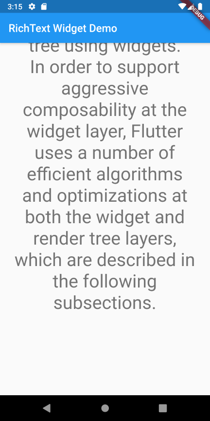
Long text Example
긴 문자열을 가지고 테스트.


Reference
'Flutter' 카테고리의 다른 글
| Flutter : SelectableText (0) | 2019.10.21 |
|---|---|
| Flutter : Navigator (0) | 2019.10.17 |
| Flutter : State management (Provider) (1) | 2019.10.11 |
| Flutter : declarative UI (0) | 2019.10.08 |
| flutter : CustomPaint (0) | 2019.10.07 |


